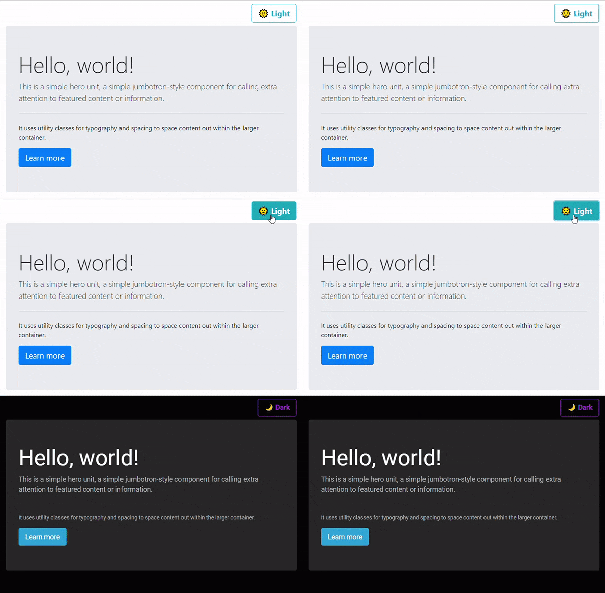
In this article we will learn how we can easily toggle between light and dark theme.
Themes in Bootstrap
While theming in Bootstrap can be done through it's built-in SASS variables, for this article we are going to use provided css stylesheets.
Bootswatch has some great themes, we're going to use it's Cyborg theme for darker variant. And for light, we are going to use Bootstrap's default theme.
So, let's get started.
Create project folder and index.html file
mkdir toggle-bootstrap-theme
cd toggle-bootstrap-theme
Create the index.html file in it:
<!DOCTYPE html>
<html lang="en">
  <head>
    <!-- Required meta tags -->
    <meta charset="utf-8" />
    <meta
      name="viewport"
      content="width=device-width, initial-scale=1, shrink-to-fit=no"
    />

    <!-- Bootstrap CSS -->
    <link
      rel="stylesheet"
      href="https://stackpath.bootstrapcdn.com/bootstrap/4.5.2/css/bootstrap.min.css"
      integrity="sha384-JcKb8q3iqJ61gNV9KGb8thSsNjpSL0n8PARn9HuZOnIxN0hoP+VmmDGMN5t9UJ0Z"
      crossorigin="anonymous"
    />

    <!-- 🚨 Notice this link -->
    <link id="dark-theme-style" rel="stylesheet" />

    <title>Toggle Bootstrap Theme</title>
  </head>
  <body>
    <nav class="navbar navbar-transparent">
      <!-- 🚨 Notice the toggleTheme() function -->
      <a
        href="javascript:void()"
        class="btn btn-outline-info btn-lg ml-auto font-weight-bold"
        id="theme-toggler"
        onclick="toggleTheme()"
      ></a>
    </nav>

    <div class="container-fluid">
      <div class="jumbotron">
        <h1 class="display-4">Hello, world!</h1>
        <p class="lead">
          This is a simple hero unit, a simple jumbotron-style component for
          calling extra attention to featured content or information.
        </p>
        <hr class="my-4" />
        <p>
          It uses utility classes for typography and spacing to space content
          out within the larger container.
        </p>
        <a class="btn btn-primary btn-lg" href="#" role="button">Learn more</a>
      </div>
    </div>

    <!-- Optional JavaScript -->
    <!-- jQuery first, then Popper.js, then Bootstrap JS -->
    <script
      src="https://code.jquery.com/jquery-3.5.1.slim.min.js"
      integrity="sha384-DfXdz2htPH0lsSSs5nCTpuj/zy4C+OGpamoFVy38MVBnE+IbbVYUew+OrCXaRkfj"
      crossorigin="anonymous"
    ></script>
    <script
      src="https://cdn.jsdelivr.net/npm/popper.js@1.16.1/dist/umd/popper.min.js"
      integrity="sha384-9/reFTGAW83EW2RDu2S0VKaIzap3H66lZH81PoYlFhbGU+6BZp6G7niu735Sk7lN"
      crossorigin="anonymous"
    ></script>
    <script
      src="https://stackpath.bootstrapcdn.com/bootstrap/4.5.2/js/bootstrap.min.js"
      integrity="sha384-B4gt1jrGC7Jh4AgTPSdUtOBvfO8shuf57BaghqFfPlYxofvL8/KUEfYiJOMMV+rV"
      crossorigin="anonymous"
    ></script>

    <!-- 🚨 Our custom JavaScript  -->
    <script src="index.js"></script>
  </body>
</html>
Notice these 2 snippet in above code:
<link> to dynamically load stylesheet
<link id="dark-theme-style" rel="stylesheet" />
Here, we will render dark theme stylesheet through JavaScript. Also note that we have kept this after our default stylesheet, so that if any rules is missing in dark one, it will be taken from default.
<a> to toggle themes
<a
        href="javascript:void()"
        class="btn btn-outline-info btn-lg ml-auto font-weight-bold"
        id="theme-toggler"
        onclick="toggleTheme()"
></a>
This anchor tag will help user to toggle between light and dark theme. We are going to create function toggleDark in JavaScript. Let's see that.
Create index.js file
// you can use app's unique identifier here
const LOCAL_STORAGE_KEY = "toggle-bootstrap-theme";

const LOCAL_META_DATA = JSON.parse(localStorage.getItem(LOCAL_STORAGE_KEY));

// you can change this url as needed
const DARK_THEME_PATH = "https://bootswatch.com/4/cyborg/bootstrap.min.css";

const DARK_STYLE_LINK = document.getElementById("dark-theme-style");
const THEME_TOGGLER = document.getElementById("theme-toggler");

let isDark = LOCAL_META_DATA && LOCAL_META_DATA.isDark;

// check if user has already selected dark theme earlier
if (isDark) {
  enableDarkTheme();
} else {
  disableDarkTheme();
}


/**
 * Apart from toggling themes, this will also store user's theme preference in local storage.
 * So when user visits next time, we can load the same theme.
 *
 */
function toggleTheme() {
  isDark = !isDark;
  if (isDark) {
    enableDarkTheme();
  } else {
    disableDarkTheme();
  }
  const META = { isDark };
  localStorage.setItem(LOCAL_STORAGE_KEY, JSON.stringify(META));
}

function enableDarkTheme() {
  DARK_STYLE_LINK.setAttribute("href", DARK_THEME_PATH);
  THEME_TOGGLER.innerHTML = "🌙 Dark";
}

function disableDarkTheme() {
  DARK_STYLE_LINK.setAttribute("href", "");
  THEME_TOGGLER.innerHTML = "🌞 Light";
}
I believe that above code is self-explanatory 😉 and no further explanation is required.
Output
After successfully writing all of the above code, you can simply open index.html in browser to see the output:

👉 The http call to dark stylesheet is done only once per session. If user switches back to light theme and then again dark theme, it is loaded from cache. See the Network panel in browser devtools to see this.
Conclusion
We learned how easily we can toggle between light and dark theme with just few lines of JavaScript code.
If you're looking for a complete Bootstrap theme generation code base with support of sass, gulp, auto-refresh, etc. checkout my github repo:
And yes, always believe in yourself...

Photo by Nick Dunlap on Unsplash


