


Custom Theme for Angular Material Components Series: Part 1 — Create a Theme


Some time back, I was going through questions on stack-overflow. A question regarding applying same theme to mat-sidenav as mat-toolbar appeared at my feed. You can check the question below:
Although I answered the question with sample code, I thought of expanding the same context to more components and make a nice formatted code-base. Which can be useful to my upcoming projects and yours, too.
By end of this series, you would have an idea about creating and applying your own Custom Theme to Angular Material Components.
Table of Contents
- Create an Angular Project using Angular CLI and add Angular Material
- Understand Angular Material Custom Theme
- Create Base Theme Files
- Update Project Structure with few new modules
- Create basic UI skeleton
1. Create an Angular Project using Angular CLI and add Angular Material
npm i -g @angular/cli
ng new theming-material-components --style=scss --skipTests --routing=false
👉
--stylewill set our styling partner, i.e.scss,--skipTestswill skip generating 'spec.ts' files for our project and--routing=falsewill not generate (and ask about) routing module. You can learn more about CLI options here.
Once it’s done...
cd theming-material-components
ng serve -o
Now, to add Angular Material, we will follow official guideline from Angular Material Getting Started:
ng add @angular/material
The ng add command will install Angular Material, the Component Dev Kit (CDK) , Angular Animations and ask you the following questions to determine which features to include:
- Choose a prebuilt theme name, or "custom" for a custom theme: Select Custom
- Set up global Angular Material typography styles?: Yes
- Set up browser animations for Angular Material?: Yes
The ng add command will additionally perform the following configurations:
- Add project dependencies to
package.json - Add the Roboto font to your
index.html - Add the Material Design icon font to your
index.html - Add a few global CSS styles to:
- Remove margins from body
- Set height: 100% on html and body
- Set Roboto as the default application font
You're done! Angular Material is now configured to be used in your application.
2. Understand Angular Material Custom Theme
Let’s look at 📄 style.scss file:
/* src/styles.scss */

/* Custom Theming for Angular Material */

/* For more information: https://material.angular.io/guide/theming */

@import "~@angular/material/theming";
/* Plus imports for other components in your app.

Include the common styles for Angular Material. We include this here so that you only
have to load a single css file for Angular Material in your app.
Be sure that you only ever include this mixin once! */

@include mat-core();

/* Define the palettes for your theme using the Material Design palettes available in palette.scss
(imported above). For each palette, you can optionally specify a default, lighter, and darker
hue. Available color palettes: https://material.io/design/color/ */

$theming-material-components-primary: mat-palette($mat-indigo);
$theming-material-components-accent: mat-palette($mat-pink, A200, A100, A400);

/* The warn palette is optional (defaults to red). */

$theming-material-components-warn: mat-palette($mat-red);

/* Create the theme object (a Sass map containing all of the palettes). */

$theming-material-components-theme: mat-light-theme(
  $theming-material-components-primary,
  $theming-material-components-accent,
  $theming-material-components-warn
);

/* Include theme styles for core and each component used in your app.
Alternatively, you can import and @include the theme mixins for each component
that you are using. */

@include angular-material-theme($theming-material-components-theme);

/* You can add global styles to this file, and also import other style files */

html,
body {
  height: 100%;
}
body {
  margin: 0;
  font-family: Roboto, "Helvetica Neue", sans-serif;
}
Notice that Angular CLI has created a basic default theme for us. Below is the summary:
- Import material theme files and include core function
- Create primary
$theming-material-components-primary, accent$theming-material-components-accentand warn$theming-material-components-warncolors from Material Color System. - Using above colors, create a lighter version of theme
$theming-material-components-themewith the help ofmat-light-thememixin. - Finally, include your custom theme in Angular Material’s Theme builder called
angular-material-theme, which is responsible for making all your components’ themes in-align with your custom theme.
We will look into more details in next part.
3. Create Base Theme Files
Now, for theme file, below is our target:
- Create default theme, I will keep this same as what we have in 📄 styles.scss.
- Create an alternate dark theme. We are going to have a theme-switcher UI, which will use default and dark themes.
- Create a typography config, just for headings (
h1,h2, etc). I am going to useWork Sansfor the same, you can change it if you want.
Create a file called 📄 theme.scss at 📁 src folder:
/* src/theme.scss */

// 👇 Importing `Work Sans` font for headings, you can change this if you want
@import url("https://fonts.googleapis.com/css2?family=Work+Sans:wght@300;400;500&display=swap");

// 👇 1. Default theme
$theming-material-components-primary: mat-palette($mat-indigo);
$theming-material-components-accent: mat-palette($mat-pink, A200, A100, A400);
$theming-material-components-warn: mat-palette($mat-red);

$theming-material-components-theme: mat-light-theme(
  $theming-material-components-primary,
  $theming-material-components-accent,
  $theming-material-components-warn
);

// 👇 2. Define an alternate dark theme.
$dark-primary: mat-palette($mat-blue-grey);
$dark-accent: mat-palette($mat-amber, A200, A100, A400);
$dark-warn: mat-palette($mat-deep-orange);
$dark-theme: mat-dark-theme(
  (
    color: (
      primary: $dark-primary,
      accent: $dark-accent,
      warn: $dark-warn,
    ),
  )
);

// 👇 3. Define a custom heading typography config
$heading-font-family: "'Work Sans', sans-serif";
$typography: mat-typography-config(
  $display-4: mat-typography-level(112px, $font-family: $heading-font-family),
  $display-3: mat-typography-level(56px, $font-family: $heading-font-family),
  $display-2: mat-typography-level(45px, $font-family: $heading-font-family),
  $display-1: mat-typography-level(34px, $font-family: $heading-font-family),
  $headline: mat-typography-level(24px, $font-family: $heading-font-family),
  $title: mat-typography-level(20px, $font-family: $heading-font-family),
);
👉 Angular's typography only works if content is wrapped within
mat-typographyCSS class. Check your 📄 index.html file,mat-typographyclass is added to<body>tag. It was done when we ranng add @angular/material.
I will create one more file named 📄 custom-component-themes.scss like below:
/* src/custom-component-themes.scss */

// import custom components themes

// you only have to add additional components here (instead of in every theme class)
@mixin custom-components-theme($theme) {
}
Basically, this file will contain all of our components' themes.
Let’s import both : 📄 theme.scss and 📄 custom-component-themes.scss in our main 📄 styles.scss and include their mixins, so our updated file will look like this:
/* src\styles.scss */

// Custom Theming for Angular Material
// For more information: https://material.angular.io/guide/theming

@import "~@angular/material/theming";
// Plus imports for other components in your app.

// Include the common styles for Angular Material. We include this here so that you only
// have to load a single css file for Angular Material in your app.
// Be sure that you only ever include this mixin once!

@include mat-core();

// import our custom theme                // 👈 changed
@import "./theme.scss";                   // 👈 changed
                                          // 👈 changed
// import custom component themes         // 👈 changed
@import "./custom-component-themes.scss"; // 👈 changed

// Include theme styles for core and each component used in your app.
// Alternatively, you can import and @include the theme mixins for each component
// that you are using.

@include angular-material-theme($theming-material-components-theme);  // 👈 changed
@include custom-components-theme($theming-material-components-theme); // 👈 changed

// 👇 added

// Include the dark color styles inside of a block with a CSS class. You can make this
// CSS class whatever you want. In this example, any component inside of an element with
// `.dark-theme` will be affected by this alternate dark theme instead of the default theme.

.dark-theme {
  @include angular-material-color($dark-theme);
}

// Override typography for all Angular Material, including mat-base-typography and all components.
@include angular-material-typography($typography);

// 👆 added

/* You can add global styles to this file, and also import other style files */

html,
body {
  height: 100%;
}
body {
  margin: 0;
  font-family: Roboto, "Helvetica Neue", sans-serif;
}
One major thing we have added is that we have wrapped dark-theme colors inside a class selector called .dark-theme. What that means is, whenever you will load any themed component inside .dark-theme wrapper, it will use $dark-theme color palette.
To understand more about use of Material Colors, checkout this color system guideline.
4. Update Project Structure with few new modules
As of now, our project structure is something like below:
Let’s create a module that has all of our Angular Material modules:
ng g m material
That will create a file and folder : 📄 material/material.module.ts. Let’s add some of modules from Angular Material to it:
// src/app/material/material.module.ts

import { NgModule } from '@angular/core';
import { MatSidenavModule } from '@angular/material/sidenav';
import { MatSliderModule } from '@angular/material/slider';
import { MatSlideToggleModule } from '@angular/material/slide-toggle';
import { MatToolbarModule } from '@angular/material/toolbar';
import { MatCheckboxModule } from '@angular/material/checkbox';
import { MatIconModule } from '@angular/material/icon';
import { MatButtonModule } from '@angular/material/button';
import { MatTooltipModule } from '@angular/material/tooltip';
import { MatMenuModule } from '@angular/material/menu';
import { MatBadgeModule } from '@angular/material/badge';
import { MatListModule } from '@angular/material/list';

@NgModule({
  exports: [
    MatSidenavModule,
    MatSliderModule,
    MatSlideToggleModule,
    MatToolbarModule,
    MatCheckboxModule,
    MatIconModule,
    MatButtonModule,
    MatTooltipModule,
    MatMenuModule,
    MatBadgeModule,
    MatListModule
  ],
})
export class MaterialModule {}
Now, let’s create a shared module, which will be a home to all of our shared modules, components, directives, pipes and services.
ng g m shared
👉 Want to learn more about shared and core modules? Head out to official angular style guide.
Now, let’s add our MaterialModule in imports array of SharedModule:
// src/app/shared/shared.module.ts

import { NgModule } from '@angular/core';
import { CommonModule } from '@angular/common';
import { MaterialModule } from '../material/material.module';

@NgModule({
  declarations: [],
  imports: [CommonModule, MaterialModule], // 👈 changed
})
export class SharedModule {}
And let’s import SharedModule in AppModule :
// app/app.module.ts
import { BrowserModule } from '@angular/platform-browser';
import { NgModule } from '@angular/core';

import { AppComponent } from './app.component';
import { BrowserAnimationsModule } from '@angular/platform-browser/animations';
import { SharedModule } from './shared/shared.module'; // 👈 <-- Added

@NgModule({
  declarations: [AppComponent],
  imports: [
    BrowserModule,
    BrowserAnimationsModule,
    SharedModule, // 👈 <-- Added
  ],
  providers: [],
  bootstrap: [AppComponent],
})
export class AppModule {}
5. Create basic UI skeleton
Let’s create a shared component SideNavComponent which we will use in our AppComponent:
ng g c shared/components/sidenav
Let’s update the content of 📄 sidenav.component.html , 📄 sidenav, component.scss and 📄 sidenav.component.ts:
<!-- src\app\shared\components\sidenav\sidenav.component.html -->

<div [class.dark-theme]="isDark"> <!-- 👈 we're wrapping whole content in a div, to handle dark/light theme -->
  <mat-toolbar [color]="themeColor">
    <span>Toolbar</span>
    <span class="example-spacer"></span>

    <!-- 👇 below button will help us change the theme at run-time. -->
    <button mat-icon-button (click)="toggleTheme()" matTooltip="Toggle dark theme">
      <mat-icon>
        brightness_6
      </mat-icon>
    </button>

    <!-- 👇 below menu will help us change the color at run-time. -->

    <button mat-button [matMenuTriggerFor]="menu" class="menu-button" matTooltip="Select a theme color">
      {{ themeColor }}
    </button>

    <ng-template #noRadio>
      radio_button_unchecked
    </ng-template>

    <mat-menu #menu="matMenu">
      <button mat-menu-item (click)="themeColor = 'primary'">
        <mat-icon [color]="themeColor === 'primary' ? 'primary' : 'no-color'">
          <ng-container *ngIf="themeColor === 'primary'; else noRadio">radio_button_checked</ng-container>
        </mat-icon>
        Primary
      </button>
      <button mat-menu-item (click)="themeColor = 'warn'">
        <mat-icon [color]="themeColor === 'warn' ? 'warn' : 'no-color'">
          <ng-container *ngIf="themeColor === 'warn'; else noRadio">radio_button_checked</ng-container>
        </mat-icon>
        Warn
      </button>
      <button mat-menu-item (click)="themeColor = 'accent'">
        <mat-icon [color]="themeColor === 'accent' ? 'accent' : 'no-color'">
          <ng-container *ngIf="themeColor === 'accent'; else noRadio">radio_button_checked</ng-container>
        </mat-icon>
        Accent
      </button>
    </mat-menu>

  </mat-toolbar>
  <mat-sidenav-container class="example-container">

    <mat-sidenav #sidenav mode="side" opened>
        <mat-nav-list>
            <h1>Sidenav</h1>
            <a mat-list-item href="#">Link 1</a>
            <a mat-list-item href="#">Link 2</a>
            <a mat-list-item href="#">Link 3</a>
      </mat-nav-list>
    </mat-sidenav>

    <mat-sidenav-content>

      <!-- 👇 our main content will be loaded here. -->

      <ng-content></ng-content>

    </mat-sidenav-content>

  </mat-sidenav-container>
</div>
Summary of 📄 sidenav.component.html:
- Create a wrapper
div, which will have theme handler classes. We are showing default theme without any class, but to show dark theme we will adddark-themeclass to it - Create a button (with theme icon), which will toggle the theme. Basically, it should have only one job to do: toggle dark theme's flag. But, we will need something more than just a simple toggle, we will look this in class file
- Create a
MatMenuwith color selection entries. This will help us change the color ofmat-toolbar - Add some dummy menu entries in sidenav
- Finally, load the main content using
<ng-content>
/* src/app/shared/components/sidenav/sidenav.component.scss */

.example-container {
  height: calc(100vh - 64px);
  .mat-sidenav {
    padding: 8px;
    min-width: 300px;
  }
  .mat-sidenav-content {
    height: calc(100vh - 64px);
  }
}
.menu-button {
  text-transform: capitalize;
}

.example-spacer {
  flex: 1 1 auto;
}

.mat-icon-no-color {
  color: rbga(0, 0, 0, 0.54);
}
Summary of 📄 sidenav, component.scss:
- Give full height (minus height of
mat-toolbar) to container, so that it takes full space of viewport (We just haveheight, because width is by default 100% for blocks which hasdisplay: blockand<div>isdisplay: blockby default). - Add padding to sidnav, so that content has some breathing space
- Capitalize content of
.meu-button. Becuase we are going to show dynamic color names, i.e.primary,accentandwarn, we should capitalize it on UI. .example-spacerwill help us to move theme switcher and menu to extreme right.mat-icon-no-colorclass will be added to radio icon in color selector menu, when that color is not selected. Instead of plain black, this should look fine.
// src\app\shared\components\sidenav\sidenav.component.ts

import { Component, OnInit, Input } from '@angular/core';
import { OverlayContainer } from '@angular/cdk/overlay';

@Component({
  selector: 'app-sidenav',
  templateUrl: './sidenav.component.html',
  styleUrls: ['./sidenav.component.scss'],
})
export class SidenavComponent implements OnInit {
  themeColor: 'primary' | 'accent' | 'warn' = 'primary'; // 👈 notice this
  isDark = false; // 👈 notice this
  constructor(private overlayContainer: OverlayContainer) {}

  ngOnInit(): void {}

  // 👇 notice below
  toggleTheme(): void {
    this.isDark = !this.isDark;
    if (this.isDark) {
      this.overlayContainer.getContainerElement().classList.add('dark-theme');
    } else {
      this.overlayContainer
        .getContainerElement()
        .classList.remove('dark-theme');
    }
  }
}
Summary of 📄 sidenav.component.ts:
themeColor: This will decide color of some components,MatToolbarin our case. This is getting change when user clicks on any color in toolbar menu.isDark: This will give whole app light/dark theme look, look at the first line of 📄 sidenav.component.html in above snippets.toggleTheme(): This will do below 2 things -- Toggle dark/light theme.
- Since certain components (e.g. menu, select, dialog, etc.) are inside of a global overlay container, an additional step is required for those components to be affected by the theme's css class selector
Let’s add SidenavComponent to exports array of SharedModule :
// src/app/shared/shared.module.ts

import { NgModule } from '@angular/core';
import { CommonModule } from '@angular/common';
import { CustomMaterialModule } from '../custom-material/custom-material.module';
import { SidenavComponent } from './components/sidenav/sidenav.component';

@NgModule({
  declarations: [SidenavComponent],
  imports: [CommonModule, CustomMaterialModule],
  exports: [SidenavComponent], // 👈 added
})
export class SharedModule {}
👉 Don’t forget to export all the components/pipes/directives which we are going to make in
SharedModule.
Now, let’s remove everything from 📄 app.component.html and replace it like below:
<!-- src\app\app.component.html -->

<app-sidenav>
  <div class="container">
    <h1 class="mat-display-3">Main Content</h1>
    <p>
      Lorem ipsum dolor sit amet consectetur adipisicing elit. Reiciendis nobis illum animi temporibus omnis.
      Consequatur qui fugit facilis reiciendis deserunt, debitis beatae! Illo dolorem asperiores nisi excepturi eum
      veritatis cupiditate.
    </p>
  </div>
</app-sidenav>
We shall also add some padding, so that it looks fine:
/* src\app\app.component.scss */

.container {
  padding: 8px;
}
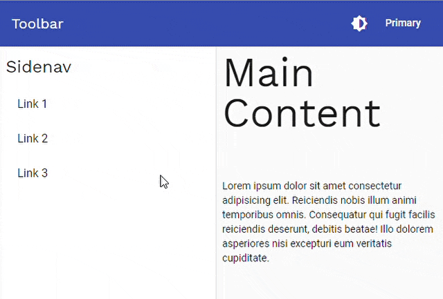
If you change theme and color from toolbar, you can see the result in browser:
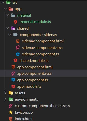
Now, the project structure is something like below:
With this, we are done with below items:
✔️ Create an Angular Project using Angular CLI and add Angular Material
✔️ Understand Angular Material Custom Theme
✔️ Create Base Theme Files
✔️ Update Project Structure with few new modules
✔️ Create basic UI skeleton
Thank You
for reading this article. Let me know your feedback and thoughts in comments section.
Whatever we’ve created in this article, I have combined them as an Angular Project, and uploaded on GitHub shhdharmen/indepth-theming-material-components:
This was the first part of the series, below is the summary of upcoming articles:
Part 2
Understand how Angular Material Theme works by taking a deep look into Angular Material’s repo.
Part 3
- Understand theme of
MatToolbar - Apply
MatToolbar’s theme toMatSidenavandMatDialog - Apply a different theme to
MatSnackbarand create nice styling for different kind of notifications (default, info, success, warning, error)
That’s it, see you next time. And yes, always believe in yourself.

Credits
Footer photos: Photo by Andy Montes de Oca on Unsplash