


This guide is written for Angular Material version 13. I am soon going to launch an article series for latest versions. Learn more
Introduction
It is a very common need in almost all applications to modify the components provided by 3rd party libraries. Those modifications are generally done for:
- Changing the styles
- Adding a missing feature
And it is very crucial for such libraries to provide ways to achieve those modifications easily.
In the first part of this tutorial we will learn how to modify styles so that our changes do not conflict with future updates of Angular Material library. As a bonus, I will provide a list of thumb rules which you should follow while making any style changes.
In the second part of this tutorial, we will learn all the ways to customize angular material buttons and decide which is better.
By end of this article, you will have idea about below topics:
- How to create attribute directive
- How to create dynamic component
- When to create component and when to create directive
- How to effectively modify any 3rd party library’s components, for both, to add a feature and to change the styles
Angular Material Button
Angular Material’s buttons are already enhanced with Material design and ink ripples, and they also have a range of presentation options.
You can change the look and feel of buttons by using different attribute directives for different situations and needs. For instance mat-button is a rectangular button with text content, mat-raised-button is the same as mat-button, but with elevation and mat-icon-button is circular and it’s meant to contain an icon. You can check all variants on the official site.
And there are 3 theme colors provided with all variants: primary, accent and warn.
Now, even with these many variants and options, we may need to modify the default Angular Material button to achieve a feature or change of style. Let’s look and learn how to make both the changes effectively.
How to change styles
Before moving into how to change styles, let’s first understand some rules to avoid any conflicting changes. These rules are consolidated from customizing component styles guidelines.
Thumb rules
Keep below rules in mind whenever you want to change styles of any Angular Material component.
- Define custom styles for a component’s host element
- Change styles which affect either position or layout of that component
margin,position,top,left,transform,z-index, etc.
- Apply above styles modifications by defining a custom CSS class and applying it to component’s host element
- Do not change the styles which affect size or internal layout of the component
padding,height,width, oroverflow
- Do not change or override the styles of internal elements of Angular Material components, like in Angular Material button, there are some internal components which produce ripple effect, we should avoid modifying styles of such components
- Provide custom styles to overlay components, like
MatDialog,MatMenu, etc. throughpanelClassproperty. Add that class to your global stylesheet after including theme mixins.
By following above rules, not just for Angular Material components but any component library, we can safely achieve needed modifications and avoid causing breaking styles.
Now, keeping the above rules in mind, we will try to change styles of Angular Material buttons. For this tutorial, we will focus on below 2 styles changes:
- Color
- Shape
And at the end of the section we will also have a brief look for size and typography.
Color
The very basic change we may need to font-color and background-color of buttons. And that, too with different states, like :hover, :focus and :active.
Some time back I wrote an article about “Angular Material Theming System: Complete Guide” and in that I wrote a section titled “Customizing Angular Material Component Styles”. In that section, I have explained how to modify the Angular Material button’s colors.
But, that approach was complex, difficult to read, hard to debug and not future safe. The reason behind that was I re-created many SASS functions and mixins, which are supposed to be used by only internal elements of buttons and used them to achieve desired changes. Now, if the Angular Material team plans to change any internal styles, those modifications will break.
So, let’s look at a more easy and recommended way to achieve color modifications.
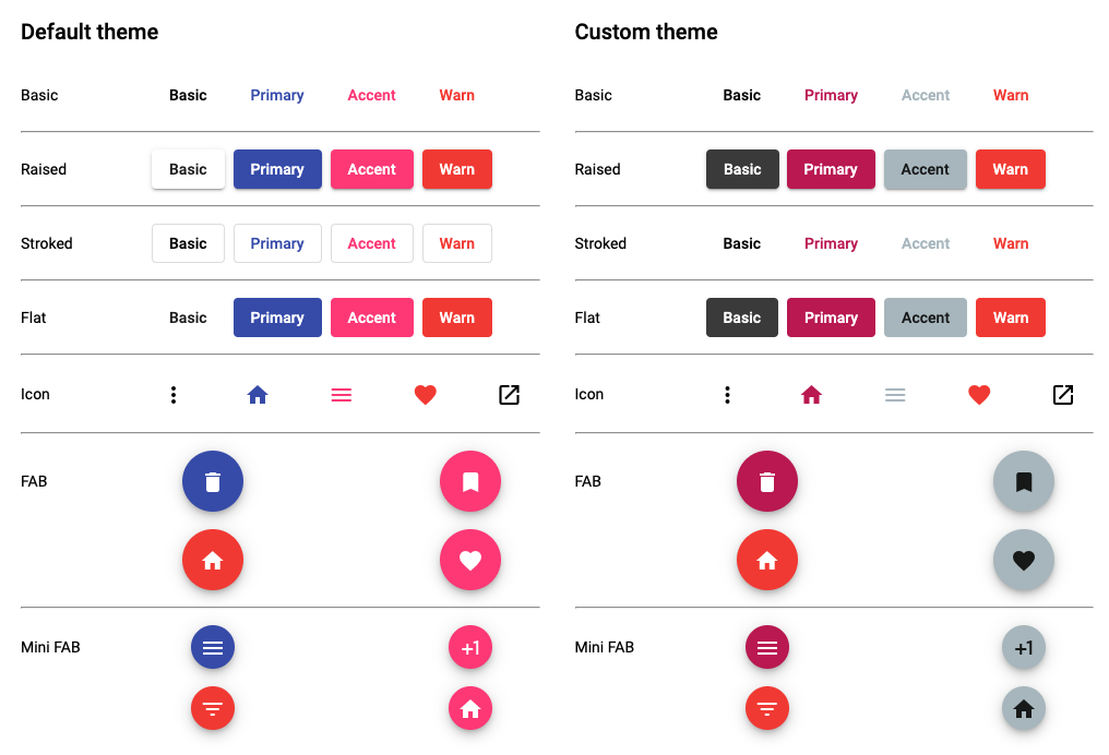
Let’s assume that you have added Angular Material in your project and selected a pre-built theme to use.
At this time, your style.scss looks like below:
// styles.scss
html,
body {
  height: 100%;
}
body {
  margin: 0;
  font-family: Roboto, "Helvetica Neue", sans-serif;
}
We will create a custom-theme, which should get applied only when it’s inside .custom-theme class.
@use "@angular/material" as mat;

$custom-primary: mat.define-palette(mat.$pink-palette, 700, 500, 900);
$custom-accent: mat.define-palette(mat.$blue-grey-palette, A200, A100, A400);

$custom-theme: mat.define-dark-theme(
  (
    color: (
      primary: $custom-primary,
      accent: $custom-accent,
    ),
  )
);

.custom-theme {
  @include mat.button-theme($custom-theme);
  @include mat.progress-spinner-theme($custom-theme);
}
Note that we have only included button-theme and progress-spinner-theme, because in our demo we only use those 2 components. You can also use all-component-theme mixin to add all components’ themes, but it will increase the size of the final output style. For a more detailed understanding, please refer to the article “Angular Material Theming System: Complete Guide”.
So, now with the above code, if in the HTML code, we simply wrap the main container with custom-theme class, it will apply custom-theme to components inside it. Let’s look at the output:
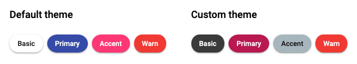
Shape
Next, let’s change the shape. We want to add a shape variant such that buttons have a rounded borders.
Now, according to thumb-rules discussed earlier, we can change the styles of host-element which affect the layout of the component itself. So, to achieve the shape change, we can simply add a class with needed changes and apply it safely to Angular Material buttons:
.button-rounded {
  border-radius: 25% / 50%;
}
Now, if you apply the class button-rounded, you won’t see the change. The reason behind that is all variants of Angular Material buttons have their own border-radius already applied like below:
.mat-raised-button {
    // rest
    border-radius: 4px;
}
So, considering selector specificity, we will have to modify our code like below:
.button-rounded {
  &.mat-button,
  &.mat-raised-button,
  &.mat-flat-button {
    border-radius: 25% / 50%;
  }
}
Now, it will look perfect in the output:
Other styles changes
Apart from color and size, there can be more changes needed. Let’s briefly look at some and how to modify them.
Size
Modifications of size are not recommended, because it violates our thumb rules. Size customizations can lead to breaking changes with future updates.
And the Angular Material team has already followed material guidelines for the size, which we should not change.
Typography
This can be easily changed by using standard Angular Material theme mixins.
$custom-theme: mat.define-light-theme((
   color: (
     primary: $custom-primary,
     accent: $custom-accent,
   ),
   typography: $custom-typography,
  ));
For more details, see "Modify typography".
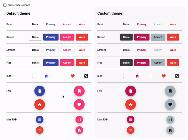
Next, we will look into how to add a spinner in the button.
How to add MatProgressSpinner
As mentioned in the heading, we will show a MatProgressSpinner when loading is set with Angular Material’s button.
Now, there are 3 ways to achieve that. Let’s look at them below and what are the pros and cons of each.
- Template Interpolation
- Wrapper Component
- Directive
Template Interpolation
For template interpolation, your code may look like this:
<button mat-button [disabled]="isLoading">
    <mat-spinner *ngIf="isLoading"></mat-spinner>
    Action
</button>
Pros
- The main advantage of above code is quick, readable and easy to customize as and when needed.
Cons
- Repetition: Above code is fine, but you will have to repeat the same lines and conditions at all places wherever you want to show
MatProgressSpinnerin buttons. - Changes at all places: If you want to change something, for example size of
MatProgressSpinner, you will have to find out all such instances and do the change.
Wrapper Component
Another approach and to overcome challenges faced with template interpolation, we can think of proceeding with creating a wrapper component with needed inputs, like below:
@Component({
    selector: 'app-button',
    template: `
        <button mat-button>
            <mat-spinner *ngIf="loading"></mat-spinner>
            <ng-content></ng-content>
        </button>
    `
})
export class AppButtonComponent {
    @Input() loading: boolean;
}
Pros
- Changes at all places: With the above, now you can use
app-buttoneverywhere to get the same button withmat-spinner. - Reusability: And if you want to change anything, you just need to change in this component and it will reflect at all places.
- Customizations: As we are using component, we can make template customizations easily
Cons
- Native component properties: Let’s assume that at different places, we want to use different variants of the Angular Material button. Now for color, you can simply add one more input and get all the variants of color. But if you want to use different presentations, like
mat-flat-buttonormat-icon-button, things will start becoming more complex. - Events: Apart from variants, you will also have to handle events, like
(click). You will have to propagate the click event using@Output()up to its parent component. - Other directives' support: Angular Material button supports it’s own
MatTooltipandMatBadgedirectives out of the box. To achieve support of all of the above in a wrapper component is not only difficult but complex and hard to maintain.
Directive
With directive, we will first start with an input of loading state, which will show/hide MatProgressSpinner and also disable/enable the MatButton. Let’s start with basic code:
@Directive({
  selector: `button`,
})
export class ButtonDirective implements OnChanges {
  @Input() loading = false;

  constructor() {}

  ngOnChanges(changes: SimpleChanges): void {
    if (!changes['loading']) {
      return;
    }

    // Create/destroy spinner
  }

  private createSpinner(): void {}

  private destroySpinner(): void {}
}
In the above code, we are creating a directive with tag selector, so that it works with all <button>s. We have added an @Input() called loading, which will show/hide the spinner inside button.
Now, to show the spinner, we are going to create the MatProgressSpinnercomponent dynamically and will place it inside thebuttonwhenloading` is set to true.
@Directive({
  selector: `button`,
})
export class ButtonDirective implements OnChanges {

  private spinner!: ComponentRef<MatProgressSpinner> | null;

  ngOnChanges(changes: SimpleChanges): void {
    if (!changes['loading']) {
      return;
    }

    if (changes['loading'].currentValue) {
        // disable the `MatButton`
        this.createSpinner();
      } else if (!changes['loading'].firstChange) {
        // enable the `MatButton`
        this.destroySpinner();
      }
  }
}
Above code is simple, we are creating and destroying spinner based on loading’s current value.
@Directive({
  selector: `button`,
})
export class ButtonDirective implements OnChanges {

  @Input() color: ThemePalette;

  constructor(
    private matButton: MatButton,
    private viewContainerRef: ViewContainerRef,
    private renderer: Renderer2
  ) {}

  private createSpinner(): void {
    if (!this.spinner) {
      this.spinner = this.viewContainerRef.createComponent(MatProgressSpinner);
      this.spinner.instance.color = this.color;
      this.spinner.instance.diameter = 20;
      this.spinner.instance.mode = 'indeterminate';
      this.renderer.appendChild(
        this.matButton._elementRef.nativeElement,
        this.spinner.instance._elementRef.nativeElement
      );
    }
  }

  private destroySpinner(): void {
    if (this.spinner) {
      this.spinner.destroy();
      this.spinner = null;
    }
  }
}
In the above code, first we added an @Input() to read the current color. We will use this property to set the color of the spinner.
Then, we provided MatButton, ViewContainerRef and Renderer2 classes in the constructor.
In the createSpinner method, we are simply creating the MatProgressSpinner dynamically and storing its reference in spinner, so that we can destroy it later on. Notice how we created it dynamically:
this.spinner = this.viewContainerRef.createComponent(MatProgressSpinner);
And after creating, we are appending it to the HTML element of MatButton, with help of Renderer2:
      this.renderer.appendChild(
        this.matButton._elementRef.nativeElement,
        this.spinner.instance._elementRef.nativeElement
      );
And at last, in the destroySpinner method, we are destroying the spinner component and cleaning it up by assigning null value.
@Directive({
  selector: `button`,
})
export class ButtonDirective implements OnChanges {

  @Input() disabled = false;

  ngOnChanges(changes: SimpleChanges): void {

  // ...

  if (changes['loading'].currentValue) {
      this.matButton._elementRef.nativeElement.classList.add('button-loading');
      this.matButton.disabled = true;
      this.createSpinner();
    } else if (!changes['loading'].firstChange) {
      this.matButton._elementRef.nativeElement.classList.remove(
        'button-loading'
      );
      this.matButton.disabled = this.disabled;
      this.destroySpinner();
    }
  }
}
The last part is to make the MatButtton disabled when loading is true. Apart from disabling, we are also toggling a class button-loading with it to achieve the desired styles.
Below is the styles code for button-loading class:
.button-loading {
  .mat-button-wrapper {
    visibility: hidden;
  }

  .mat-progress-spinner {
    position: absolute;
    top: calc(50% - 10px);
    left: calc(50% - 10px);
  }
}
And the final code for directive looks like below:
@Directive({
  selector: `button`,
})
export class ButtonDirective implements OnChanges {
  private spinner!: ComponentRef<MatProgressSpinner> | null;

  @Input() loading = false;
  @Input() disabled = false;
  @Input() color: ThemePalette;

  constructor(
    private matButton: MatButton,
    private viewContainerRef: ViewContainerRef,
    private renderer: Renderer2
  ) {}

  ngOnChanges(changes: SimpleChanges): void {
    if (!changes['loading']) {
      return;
    }

    if (changes['loading'].currentValue) {
      this.matButton._elementRef.nativeElement.classList.add('button-loading');
      this.matButton.disabled = true;
      this.createSpinner();
    } else if (!changes['loading'].firstChange) {
      this.matButton._elementRef.nativeElement.classList.remove(
        'button-loading'
      );
      this.matButton.disabled = this.disabled;
      this.destroySpinner();
    }
  }

  private createSpinner(): void {
    if (!this.spinner) {
      this.spinner = this.viewContainerRef.createComponent(MatProgressSpinner);
      this.spinner.instance.color = this.color;
      this.spinner.instance.diameter = 20;
      this.spinner.instance.mode = 'indeterminate';
      this.renderer.appendChild(
        this.matButton._elementRef.nativeElement,
        this.spinner.instance._elementRef.nativeElement
      );
    }
  }

  private destroySpinner(): void {
    if (this.spinner) {
      this.spinner.destroy();
      this.spinner = null;
    }
  }
}
Above code is referenced from: Button | Angular Material Extensions (ng-matero.github.io)
Now, with Angular Material buttons, you just need to set loading to show a spinner inside of it. Let’s take a look at output:
Let’s look at the above approach’s pros and cons.
Pros
- Native component properties: As you can see in the output, the directive works with all variants of
MatButton - Events: Also, there is no need to write extra code handle event
- Other directives' support: As we used directive, other library directives’ support, like
MatBadge,MatTooltipstill exists
Cons
- No template control: We do not have template control with this approach compared to wrapper component and inline template interpolation
- More DOM manipulation: As we do not have template control, we have to do every template change through DOM manipulation
So, compared with template interpolation and wrapper components, the reusability without losing default features is the main and biggest advantage of this approach. And that’s why, one should try to achieve such customizations with usage of directive.
Conclusion
We started with understanding why and which customizations can be needed when using any 3rd party UI components library. Then we understood what Angular Material components library provides especially for buttons.
Next, we compared all the approaches mentioned below to add a spinner in Angular Material buttons:
- Template interpolation - quick and easy to understand, but reusability is missing
- Wrapper component - reusability is achieved, but more complex code and setup required to keep support of default functionalities
- Directive - support for default functionalities and reusability, both achieved with less control over template
Then, we understood some thumb rules to prevent our custom styling from breaking with major updates. Next we learned how to effectively modify color, size and typography. And why we shouldn’t modify the size of the Angular Material button.
I have uploaded the code at GitHub, you can also take a look at it on stackblitz.