


Struggling with changing colors of angular material buttons?
Not anymore! Read on...
Let’s assume that you have added Angular Material in your project and selected a pre-built theme to use.
We will create a custom-theme, which should get applied only when it’s inside .custom-theme class.
@use "@angular/material" as mat;

$custom-primary: mat.define-palette(mat.$pink-palette, 700, 500, 900);
$custom-accent: mat.define-palette(mat.$blue-grey-palette, A200, A100, A400);

$custom-theme: mat.define-dark-theme(
  (
    color: (
      primary: $custom-primary,
      accent: $custom-accent,
    ),
  )
);

.custom-theme {
  @include mat.button-theme($custom-theme);
}
Note that we have only included button-theme, because in our demo we only use that component. You can also use all-component-theme mixin to add all components’ themes, but it will increase the size of the final output style.
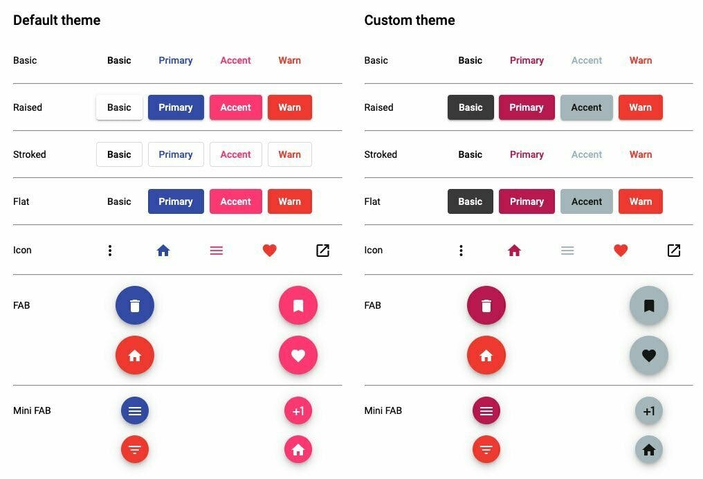
So, now with the above code, if in the HTML code, we simply wrap the buttons in custom-theme class, it will apply custom-theme to components inside it. Let’s look at the output:
That's a wrap!
For more details, read full article at: