


Custom Theme for Angular Material Components Series: Part 2 — Understand Theme


Let's understand Theme of Angular Material and its different Components by taking a deep look into Angular Material Components' github repo.
This is the second part of the series. First, we created an Angular Project with a custom theme, a dark theme, custom typography for headings and couple of helper modules (MaterialModule and SharedModule).
If you haven't, please visit the first part at below link:
In this part, we will understand Material Theming by taking a deep look into Angular Material Components' github repo.
Understand Material Theming: A deep look into Angular Material Components' repo
Let’s take a look at related stylesheets on their GitHub repo. I would request you to open up repo in new tab or window, because we are going to check some files from it.
I would also recommend you to clone and open the code base from my GitHub, for better understanding when referred.
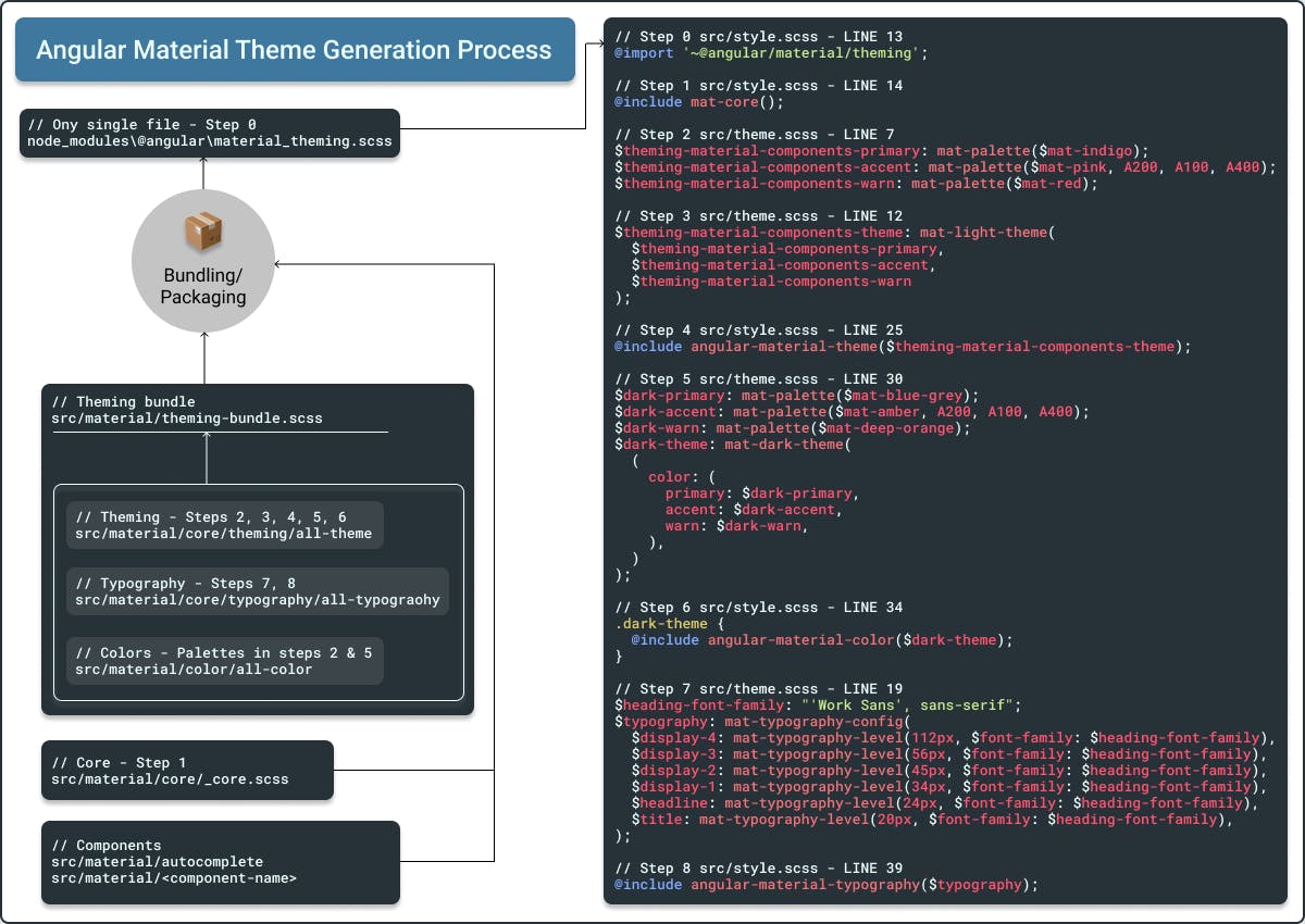
Theme Generation Process
I will guide you through some important folders and files from Angular Material's repo, which are directly related to our application's Material Theme. But before that, I would like to remind you that in our application’s 📄 styles.scss and 📄 theme.scss files, we have these very important lines. I have combined lines from both the files and have also referenced through a step number:
Step 0️⃣ src/style.scss - LINE 7
@import '~@angular/material/theming';
Step 1️⃣ src/style.scss - LINE 13
@include mat-core();
Step 2️⃣ src/theme.scss - LINE 7
$theming-material-components-primary: mat-palette($mat-indigo);
$theming-material-components-accent: mat-palette($mat-pink, A200, A100, A400);
$theming-material-components-warn: mat-palette($mat-red);
Step 3️⃣ src/theme.scss - LINE 12
$theming-material-components-theme: mat-light-theme(
  $theming-material-components-primary,
  $theming-material-components-accent,
  $theming-material-components-warn
);
Step 4️⃣ src/style.scss - LINE 25
@include angular-material-theme($theming-material-components-theme);
Step 5️⃣ src/theme.scss - LINE 30
$dark-primary: mat-palette($mat-blue-grey);
$dark-accent: mat-palette($mat-amber, A200, A100, A400);
$dark-warn: mat-palette($mat-deep-orange);
$dark-theme: mat-dark-theme(
  (
    color: (
      primary: $dark-primary,
      accent: $dark-accent,
      warn: $dark-warn,
    ),
  )
);
Step 6️⃣ src/style.scss - LINE 34
.dark-theme {
  @include angular-material-color($dark-theme);
}
Step 7️⃣ src/theme.scss - LINE 19
$heading-font-family: "'Work Sans', sans-serif";
$typography: mat-typography-config(
  $display-4: mat-typography-level(112px, $font-family: $heading-font-family),
  $display-3: mat-typography-level(56px, $font-family: $heading-font-family),
  $display-2: mat-typography-level(45px, $font-family: $heading-font-family),
  $display-1: mat-typography-level(34px, $font-family: $heading-font-family),
  $headline: mat-typography-level(24px, $font-family: $heading-font-family),
  $title: mat-typography-level(20px, $font-family: $heading-font-family),
);
Step 8️⃣ src/style.scss - LINE 39
@include angular-material-typography($typography);
Just keep in mind these lines, we are going to relate them with some of the files from Angular Material repo's 📂src/material folder.
Tip: Look for the 💡, ⛳, ☝️, 👈, 👉, ✅ or numeric symbols in the rest of article, that will help you relate.
📁 src/material
In this folder, you can see that they have made folders for each Material Component (autocomplete, badge, bottom-sheet, etc.) and few other helpers (core, testing, schematics, etc.).
📁 src/material/
For each component, there is a separate folder. And in each component they have a theme file. Theme file’s naming pattern is : _component-name-theme.scss. So, for MatToolbar , it’s _toolbar-theme.scss and full path of the same is: src/material/toolbar/_toolbar-theme.scss.
👉 Now you know how to find a theme file for any Angular Material Component.
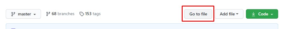
The other way to find components’ themes is through 💡 Go to file. Once you have opened the repo, click on Go to file button, which is on the right side of breadcrumbs.
And then you can search with file names:
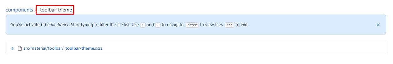
You can simply enter filename in the pattern of: _component-name-theme.scss and you will directly see the related file.
👉 Each component has a theme file. We will see later on, how that is included in our application.
📁 src/material/core
This has core library code for other @angular/material components. Other Material Components means, simply the components which you can’t see directly at https://material.angular.io/components/categories, but they are crucial.
Let’s dive in to this folder.
📄 src/material/core/_core.scss
Let's take a look at file:
@import '../../cdk/overlay/overlay';
...

// Core styles that can be used to apply material design treatments to any element.
@import './style/elevation';
...

// Mixin that renders all of the core styles that are not theme-dependent.
@mixin mat-core($typography-config: null) {
  ...
}

@mixin mat-core-color($config-or-theme) {
  ...

    background-color: mat-color($background, background);
    color: mat-color($foreground, text);
  ...
  // Provides external CSS classes for each elevation value. Each CSS class is formatted as
  // `mat-elevation-z$zValue` where `$zValue` corresponds to the z-space to which the element is
  // elevated.
  @for $zValue from 0 through 24 {
    .#{$_mat-elevation-prefix}#{$zValue} {
      @include _mat-theme-elevation($zValue, $config);
    }
  }

  // Marker that is used to determine whether the user has added a theme to their page.
  @at-root {
    .mat-theme-loaded-marker {
      display: none;
    }
  }
}

// Mixin that renders all of the core styles that depend on the theme.
@mixin mat-core-theme($theme-or-color-config) {
  ...
   @include mat-core-color($color);
  ...
}
...
To summarize, below is what's happening in this file:
- All of the CDK related styles are imported
- Other core styles are imported (elevation, ripples, etc.), which can be used to apply material design treatments to any element
- A mixin called 💡
mat-coreis created. As the comment says, this renders all of the core styles that are not theme-dependent, like ripple effects, CDK behaviors, etc. 👉 Now you know from where you are includingmat-corein application’s 📄 styles.scss (Line 14). A mixin called 💡
mat-core-themeis created. As per comments, this renders all of the core styles that depend on the theme, like color combination of ripples, color combination of elevations, etc. This also utilizes themat-core-colormixin, which handles 3 things, discussed below:It gives background and font-color to our app.
- It generates elevation classes, e.g.
mat-elevation-z1. You can read it's guide here. - It creates a marker that is used to determine whether we have added a theme. In a brief, this is how they check if theme is present:
private _checkThemeIsPresent(): void {
    ...

    const testElement = document.createElement('div');

    testElement.classList.add('mat-theme-loaded-marker');
    document.body.appendChild(testElement);

    const computedStyle = getComputedStyle(testElement);
    if (computedStyle && computedStyle.display !== 'none') {
      console.warn(...);
    }

    document.body.removeChild(testElement);
  }
This is how they check if we have added a theme. Code is reduced for clarity.
So, there are 2 key takeaways from 📄 _core.scss:
mat-core- This will render all core styles which are not theme-dependent. We are including this in our 📄 styles.scss directly, step 1️⃣ of theme generation process.mat-core-theme- This will render all core styles which are theme-dependent. But we haven't included this in our 📄 styles.scss directly, we will see later how this is included.
📁 src/material/core/style
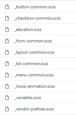
The style folder contains some common styling files. File names should give you a basic idea what it does. We won't go into much detail of each file.
📁 src/material/core/theming
This folder contains all the styles related to theming. Let’s go into it.
📁 src/material/core/theming/prebuilt
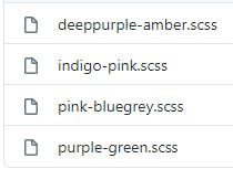
As you can see, it contains all 💡 prebuilt themes.
📄 src/material/core/theming/_theming.scss
// Creates a map of hues to colors for a theme. This is used to define a theme palette in terms of the Material Design hues.
@function mat-palette($base-palette, $default: 500, $lighter: 100, $darker: 700, $text: $default) {
  ...
}

// Creates a container object for a light theme to be given to individual component theme mixins.
// as it would break existing apps that set the parameter by name.
@function mat-light-theme($primary, $accent: null, $warn: mat-palette($mat-red)) {
...
}

// Creates a container object for a dark theme to be given to individual component theme mixins.
// as it would break existing apps that set the parameter by name.
@function mat-dark-theme($primary, $accent: null, $warn: mat-palette($mat-red)) {
...
}
mat-palettefunction is responsible to generate and return a color-map based on color palette we provide. We are ✅ using this in 📄 theme.scss (Line 7), to generate primary, accent and warn theme color-maps, step 2️⃣.mat-light-themefunction creates a light theme variant for given theme-color palettes. This is ✅ used in 📄 theme.scss (Line 12) to create our default theme$theming-material-components-theme, step 3️⃣.mat-dark-themefunction does the same as above, but for a darker version. We are using this in step 5️⃣.
📄 src/material/core/theming/_palette.scss
This file has all the color palettes from the Material Design spec.
👉 This file gives us access to all the color palettes in 📄 theme.scss, e.g. $mat-indigo, $mat-pink, $mat-red, etc.
📁 src/material/core/theming/_all-theme.scss
// Import all the theming functionality.
@import '../core';
...

// Create a theme.
@mixin angular-material-theme($theme-or-color-config) {
  @include _mat-check-duplicate-theme-styles($theme-or-color-config, 'angular-material-theme') {
    @include mat-core-theme($theme-or-color-config);
    ...
  }
}
As you can see, it has imported 💡 all the Material Component Themes in it, plus 💡 mat-core-theme from _src/material/core/core.scss. And all the mixins are included in a new 💡 mixin called angular-material-theme.
Does angular-material-theme mixin sound familiar? Yes, we have included it in our 📄 styles.scss (Line 25) file, step 4️⃣. Also note that mat-core-theme is included here, so that's why unlike mat-core, we don't need to include it separately.
📄 src/material/core/color/_all-colors.scss
@import '../theming/all-theme';

// Includes all of the color styles.
@mixin angular-material-color($config-or-theme) {
  // In case a theme object has been passed instead of a configuration for
  // the color system, extract the color config from the theme object.
  $config: if(_mat-is-theme-object($config-or-theme),
      mat-get-color-config($config-or-theme), $config-or-theme);

  @if $config == null {
    @error 'No color configuration specified.';
  }

  @include angular-material-theme((
    color: $config,
    typography: null,
    density: null,
  ));
}
angular-material-color, this mixin helps us to generate a colored theme. If you check our 📄 styles.scss (Line 34), we are including this to generate the dark-theme, step 6️⃣.
📄 src/material/core/typography/_typography.scss
...

// Represents a typography level from the Material design spec.
@function mat-typography-level(
  $font-size,
  $line-height: $font-size,
  $font-weight: 400,
  $font-family: null,
  $letter-spacing: normal) {

  @return (
    font-size: $font-size,
    line-height: $line-height,
    font-weight: $font-weight,
    font-family: $font-family,
    letter-spacing: $letter-spacing
  );
}

...

// Represents a collection of typography levels.
// Defaults come from https://material.io/guidelines/style/typography.html
// Note: The spec doesn't mention letter spacing. The values here come from
// eyeballing it until it looked exactly like the spec examples.
@function mat-typography-config(
  $font-family:   'Roboto, "Helvetica Neue", sans-serif',
  $display-4:     mat-typography-level(112px, 112px, 300, $letter-spacing: -0.05em),
  $display-3:     mat-typography-level(56px, 56px, 400, $letter-spacing: -0.02em),
  $display-2:     mat-typography-level(45px, 48px, 400, $letter-spacing: -0.005em),
  $display-1:     mat-typography-level(34px, 40px, 400),
  $headline:      mat-typography-level(24px, 32px, 400),
  $title:         mat-typography-level(20px, 32px, 500),
  $subheading-2:  mat-typography-level(16px, 28px, 400),
  $subheading-1:  mat-typography-level(15px, 24px, 400),
  $body-2:        mat-typography-level(14px, 24px, 500),
  $body-1:        mat-typography-level(14px, 20px, 400),
  $caption:       mat-typography-level(12px, 20px, 400),
  $button:        mat-typography-level(14px, 14px, 500),
  // Line-height must be unit-less fraction of the font-size.
  $input:         mat-typography-level(inherit, 1.125, 400)
) {

  // Declare an initial map with all of the levels.
  $config: (
    display-4:      $display-4,
    display-3:      $display-3,
    display-2:      $display-2,
    display-1:      $display-1,
    headline:       $headline,
    title:          $title,
    subheading-2:   $subheading-2,
    subheading-1:   $subheading-1,
    body-2:         $body-2,
    body-1:         $body-1,
    caption:        $caption,
    button:         $button,
    input:          $input,
  );

  ...
  @return map-merge($config, (font-family: $font-family));
}
...
mat-typography-level- this function returns a map, which then will be used to get font-size, line-height, font-weight, font-family and letter-spacing for a particular level. This is part of step 7️⃣ of theme generation process. For a particular font-family and level, if you want help to generate, visit type scale generator.mat-typography-config- this function returns a map of combining all levels (headings, body fonts, buttons, input, etc.) of typography. With help of this function, we are generating our custom typography config in step 7️⃣.
📄 src/material/core/typography/_all-typography.scss
...

// Includes all of the typographic styles.
@mixin angular-material-typography($config-or-theme: null) {
  ...
  @include mat-badge-typography($config);
  @include mat-base-typography($config);
  ...
}
This file has one mixin, angular-material-typography, which takes a $config-or-theme as parameter and includes all of components' (badge, button, bottom-sheet, auto-complete, etc.) typyographies. We are including this mixin in 📄 src/style.scss (Line 39), step 8️⃣ of theme generation process.
Great! We are done with inspecting and finding related stylesheets.
But, if you check in our 📄 styles.scss file we are only importing one single file **_@import '~@angular/material/theming';_** in step 0️⃣. Let's see how all other files are getting included with it:
💡 When Angular Material Team packages and publishes the Angular Material Package (@angular/material), they combine all the theming, typography, styles and core styles into one single file called_ _theming.scss_, so that we don’t have to import multiple files.
💡 You can check the same by opening the file. In your project folder open this : node_modules/@angular/material/_theming.scss_. The first comment/line in the file says : "File for which all imports are resolved and bundled. This is the entry-point for the
@angular/materialtheming Sass bundle. See//src/material:theming_bundle.".💡 Pre-built theme files are not included in main_ _theming.scss_. The reason behind that is but obvious, if you want to create your custom theme, you wouldn’t want pre-built theme files load into your application. And if you want to include any of pre-built themes, we import the respective theme file.
Conclusion
We saw how theme generation works by taking an in-depth look into Angular Material Component's Github repo. It's worth mentioning that we haven't seen how bundling / packaging works, we have just seen how theming works.
For a quick revision, I have created an infographic, checkout below:
Thank you,
for reading this article. In the next part, we will use some of Angular Material components, modify and extend their themes. Let me know your thoughts and feedback in comments section.